
Color is an integral part of the visual experience of humans. Through color, we receive a wealth of information about light, materials, and textures, critical during our interaction with our environment. In our image-making context, color can either make or break a scene. Using it correctly can help us convey the intended mood and guide the viewer to what’s important. Using it wrongly can destroy continuity, impair realism, or otherwise disturb and confuse the viewer. In short, color can be considered our primary tool in creating a believable image.
This is the first chapter from a full workshop that comes under the title Understanding Color. Going into the science and technicalities of color is not exactly the focus of this workshop. Still, a quick glance at how humans perceive it and how it is connected to light will surely do no harm! This will be the only technical chapter. Everything that will follow will focus on the artistic side of things.
In order to talk about color, one needs to talk about light first. There are two important concepts here:
1. Light is a form of energy.
2. Light energy travels in waves.
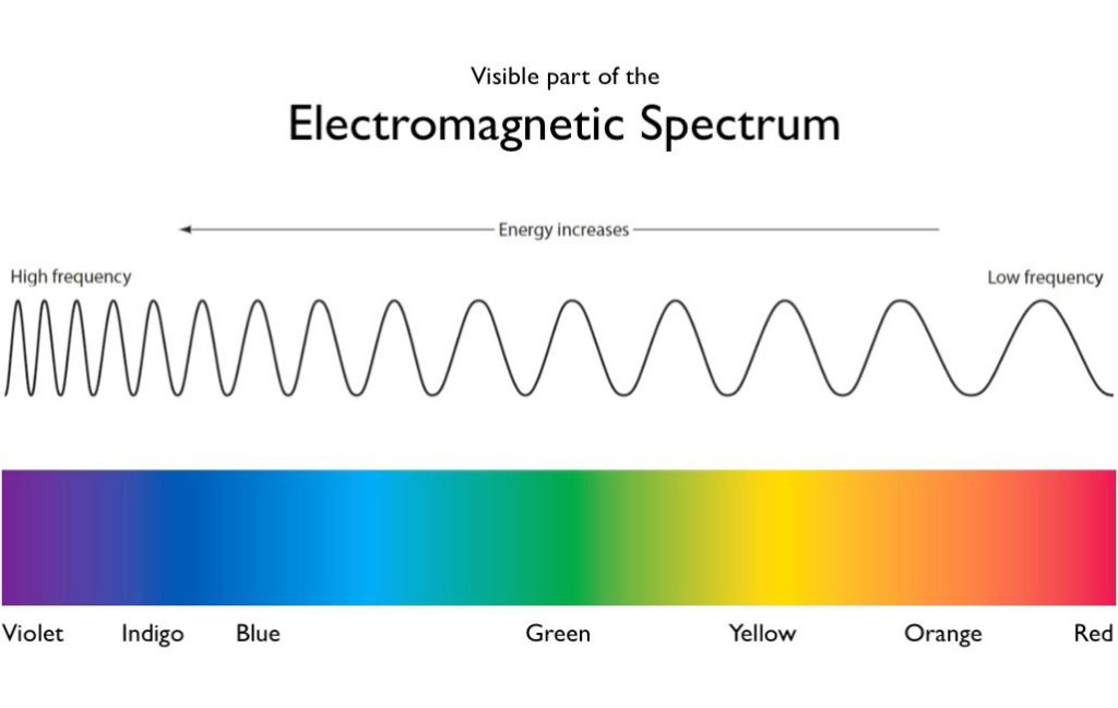
As with all waves, light waves come in different lengths. Blue light waves, for example, are shorter than red light waves. To have shorter wavelength means to have a higher frequency and thus more energy.
Light travels strictly on a straight line unless something gets in the way and that something will do one of the following:
1. Reflect it (as with a mirror)
2. Refract it (bend it as with a prism or lens)
3. Scatter it (as with molecules of gases in the atmosphere)
So, in a way, light is the source of all colors. But why do objects appear to have a certain color? When light hits an object, the object’s surface will selectively reflect and absorb certain wavelengths of it. An apple, for example, appears red, because its surface reflects the red light waves and absorbs the rest. This is what happens with all color pigments. They absorb all light wavelengths except for the ones corresponding to their color. Only the latter ones will be reflected and finally reach our eye.
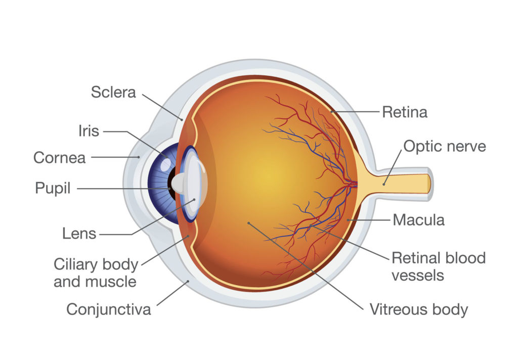
And that brings us to the second important topic of the subject: the human eye. Without going into great detail, let’s say that light, after passing through the pupil and the lens, meets the retina, which functions much like the film in a camera. The retina is made of photoreceptor cells which come in two main types: rods and cones (there’s also a third one but we’ll not worry about it here). Rods are sensitive to light intensity while cones are sensitive to light wavelength which, as we’ve seen, corresponds to color! Signals from the cones are sent to the brain which translates these messages into the perception of color.
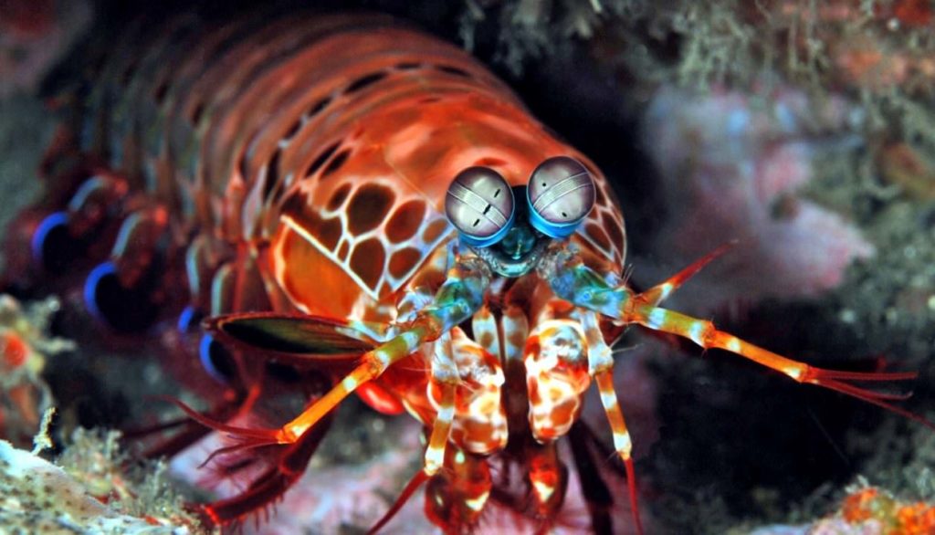
Cones are most sensitive to one of three colors: red, green, or blue. Yes, that’s the famous RGB system! Humans, thus, have a trichromatic color system but that’s not the case with all animals. The mantis shrimp, for example, has an incredibly rich color system. It has between 12 and 16 photoreceptors when humans only have three. This means that it can see way beyond the light spectrum that is visible to us. It can see ultraviolet (UV) and infrared! These are some pretty amazing eyes!
The take-home message from this chapter can be this: what we perceive as color is the result of how our brain translates certain light wavelengths with the help of photoreceptors in our eye’s retina. This knowledge may not have a direct effect on the process of crafting an image but it helps us adopt a more scientific position in our domain. Our job is to play with human perception (visual perception in our case) in order to convey certain meanings. The more we know about it, the better our messages will be.
But there’s another interesting idea here that someone can make use of. Knowing how light functions in the real world can upgrade our way of building an image. Looking at our scene as a sum of light rays bouncing off objects until they reach our camera (or eyes) can give us a better sense of value (light and shadow) and color. Visualizing in our head the journey light takes in our scene, as it is reflected, scattered or absorbed, can help us bring more realism if that’s what we’re after. Don’t forget that this is exactly what happens whenever we press the render button in our 3D software. Again, we can heavily elaborate on these topics but we’ll leave it to that for now.
Sources:
1. https://chrisbrejon.com/cg-cinematography/chapter-1-color-management/#introduction
2. https://www.blenderguru.com/tutorials/understanding-colors
3. http://faculty.washington.edu/chudler/retina.html
Great Text!!!! Thank you and keep up the good work!
Looking forward to the rest of the full workshop!
If i may, i would like to add imho an important topic about color perception: It is very individual.
– i.e. It is common knowledge that a lot of men have a red-green blindness – less common knowledge though, is that 5% of women do have more or rather different receptors.
So, my point is, than in our line of work, when discussing colors, it is often important to sit next to each other and evaluate the colors on the same media…
because i might see the same green like you with a hue of yellow, while you see it with a hue of blue… and we both would be right 😉
here an interesting link to this topic – an interview with donald hoffmann:
https://soundcloud.com/youarenotsosmart/090-reality-donald-hoffman#t=14:16
Hi Giulio!
Many thanks for your constructive comment. The podcast you posted is also fascinating.
It is true that color perception varies among individuals and sexes and that’s something we can keep in mind in our domain of visual communication.
Another interesting fact is that women are more sensitive in subtle color gradations than men. In other words, women are able to distinguish tiny differences between colors that may look identical to men.
Men, on the other hand, are better able to perceive changes in brightness across space and are more sensitive to fine details and rapid movement.
You can find Abramov’s full study of the subject here: https://www.researchgate.net/publication/230789238_Sex_and_vision_II_Color_appearance_of_monochromatic_lights
Have a nice day and stay tuned for more!